

The Frosted Glass Ceiling
Liquid Glass marks Apple’s retreat into design as performance.

I still remember selling phones at Verizon when Siri first came out. We’d demo it by saying “Remind me to take out the trash” and people would light up. It felt like the future. You could talk to your phone, and it would talk back—and actually do something useful. It was simple, it was concrete, and it made people feel like their device just got a brain. That was more than a feature. It was a moment.

But Apple just announced its most ambitious UI redesign in over a decade: Liquid Glass. A translucent aesthetic draped across iOS, iPadOS, and macOS. It’s bold. It’s dramatic.
And it’s functionally hollow.
I wanted to believe this was the start of something deeper. That maybe the shimmer was a visual handshake for something smarter underneath. A new Siri. An actual leap. But it wasn’t. There were nods to “Apple Intelligence,” but the most important parts (like a better Siri) are delayed.
This update doesn’t unlock new capabilities. It doesn’t offer new workflows. It doesn’t change how people interact with their devices in any meaningful way. It’s a coat of paint, not a new engine.
Aesthetic Without Utility
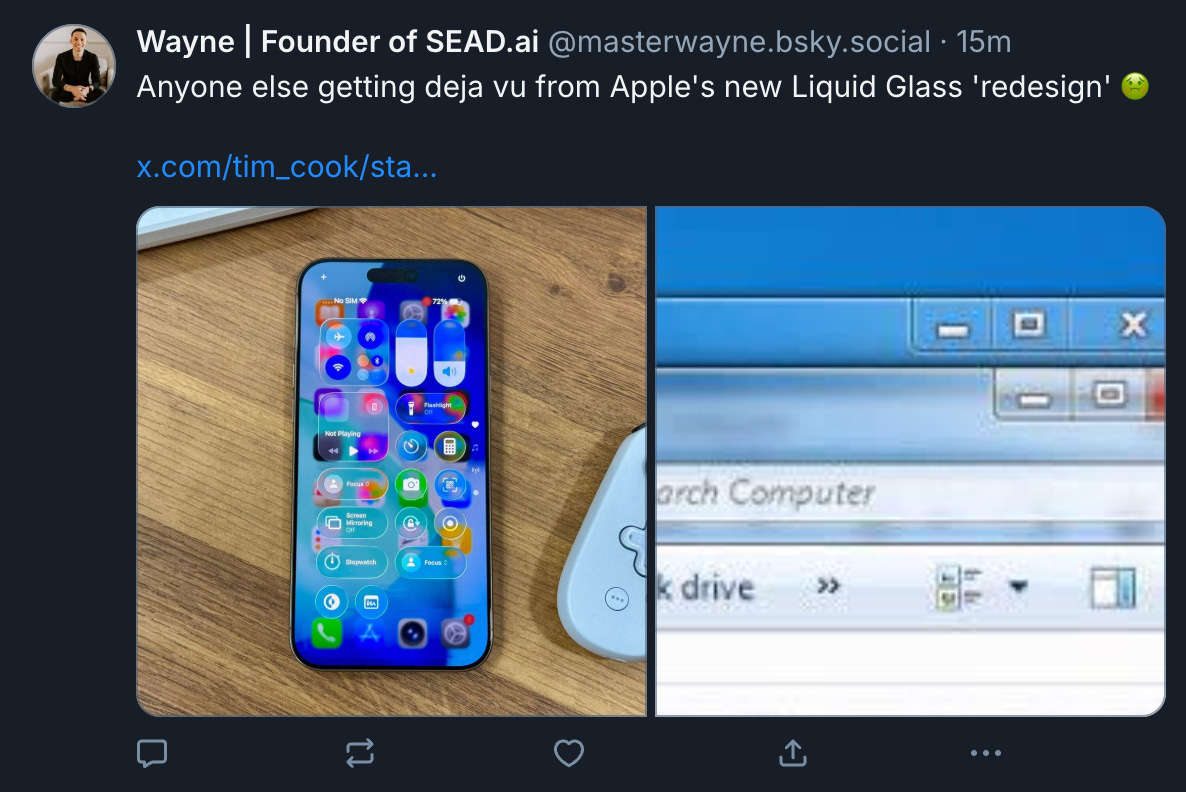
There’s a reason the internet keeps comparing Liquid Glass to Windows Vista. It’s not just the visual similarity. It’s the pattern: when a platform’s innovation curve slows, leaders often reach for design drama to signal momentum. Transparency. Animations. Rounded everything. The illusion of progress without the substance.
This isn’t a knock on Apple’s designers. The work is polished like always. But design is supposed to be in service of the product. While Google is embedding generative AI into every layer of interaction, Apple’s top headline is that your screen looks more like a frozen piece of glass.
What This Says About Strategy
Apple’s real advantage has never been raw capability. It’s almost always a year or two later in releasing the same features Google does. Its advantage has always been product coherence: software and hardware designed together, unlocking real-world capability through thoughtful integration. Grandparents can use it.
But Liquid Glass feels like the opposite of that. It’s not grounded in use cases. It’s not anchored to user needs. It’s aesthetic abstraction. And that abstraction is arriving precisely when clarity, capability, and forward motion are most needed.
They did add features, to be clear. The iPad finally got real multitasking. Spotlight got more useful. But those didn’t headline. Instead, Apple led with the sparkle. That’s telling. It suggests they’re trying to preserve the brand aura without shipping the substance that built it.
Here’s the Takeaway
Design is a system. And like any system, it should exist to unlock capability. When it doesn’t, when it becomes ornamental instead of operational, it’s a missed opportunity.
This moment didn’t need a translucent UI. It needed a smarter one.
Siri used to feel like magic. Now I skip it entirely and go straight to ChatGPT because it works. Google knows this and Gemini is everywhere now, layered into the tools, the workflows, even the glasses. It’s not perfect, but it’s moving forward.
Apple had a chance to pivot and shift the narrative from elegance to intelligence… To show that it still leads not just in taste, but in tools.
But they didn’t. They just changed the wallpaper.